Fix Shopify Dawn Theme Mobile Layout Issues (Complete Guide)
TL;DR
This guide breaks down Shopify Dawn theme mobile layout broken with practical implementation steps, common risks, and the fastest path to measurable Shopify improvements.
Why Dawn Theme Mobile Layouts Break (And Why It Matters)
Mobile layout problems on Dawn theme stores cost merchants real revenue.
More than 60% of Shopify traffic comes from mobile devices. Yet many Dawn stores deliver suboptimal mobile experiences that drive potential customers away.
The Mobile-First Reality of Ecommerce
The average ecommerce conversion rate on mobile devices from the past 12 months is 2.96%, 0.11 percentage points higher than the latest rate registered in October 2024, while conversion rates on mobile are lower than that of desktops and tablets, which are 3.85% and 3.49%, respectively.
The gap between mobile and desktop conversion rates represents massive untapped revenue.
Desktop still converts 35–70% better than mobile devices despite mobile commanding 68–79% of all traffic—a gap representing a $2–4 trillion global opportunity.
For Dawn theme stores specifically, this mobile conversion gap often stems from layout issues rather than fundamental design problems. The good news? Most mobile layout issues can be fixed without rebuilding your entire store.
Dawn is mobile-responsive out of the box, which means it scales the desktop layout down to fit a smaller screen. That's different from being mobile-optimized, which means the layout is designed for how people actually use their phones.
This distinction matters because responsive design solves technical display issues but doesn't address mobile user behavior patterns.
Product page work, cart behavior, variant selectors, mobile fixes, and content organization - these are the top requests by volume, and they're the right ones to focus on.
Common Triggers for Mobile Layout Breaks
Dawn theme mobile layouts typically break due to:
Breakpoint conflicts:
Its menu swaps to a mobile drawer at 990 pixels.
Many merchants need this adjusted to 750px for better tablet experience.
Image sizing issues:
It's annoying having a wide landscape image on desktop be handled so poorly on mobile.
Touch target problems:
The add-to-cart button is too small to tap comfortably. Minimum tap target size for mobile is 44px by 44px.
Expand details: Mobile Layout Issue · Impact on Conversion · Fix Complexity
Mobile Layout Issue
Impact on Conversion
Fix Complexity
Small tap targets
High
Low
Hidden price/title
High
Medium
Image carousel breaks
Medium
Medium
Menu navigation issues
Medium
Low
Dropdown form problems
High
High
Baymard Mobile Usability Research
Source: baymard.com · Captured: Apr 1, 2026
Instant Mobile Layout Diagnostic Checklist
Start by identifying exactly where your mobile layout fails. This diagnostic checklist helps you pinpoint specific problems before attempting fixes.
Visual Layout Test on Real Devices
Test your store on actual mobile devices, not just browser tools:
iPhone (Safari): Check both standard and Plus/Max sizes
Android (Chrome): Test different screen densities
Tablet (both orientations): Verify iPad and Android tablet layouts
Look for these immediate red flags:
Text that requires zooming to read
Buttons smaller than your thumb tip
Horizontal scrolling on any page
Images that don't fit the screen properly
Chrome DevTools Mobile Testing
A developer can audit the mobile product page in Chrome DevTools, identify the specific breakpoints causing problems, and fix them without changing the desktop layout.
Focus your testing on conversion-critical elements:
Above-the-fold content: Product title, price, and primary image must be visible without scrolling
Add-to-cart button: Must be easily tappable and clearly visible
Variant selectors: Dropdowns should work smoothly on touch devices
Navigation menu: Should open/close reliably on all screen sizes
Image galleries: Should swipe naturally without layout breaks
"The most common mobile product page problems on Dawn stores: The product images are too small. On mobile, the image is the product." - TaskHusky Dawn Theme Analysis
These five categories represent the majority of Dawn mobile layout problems reported by merchants. Each has specific symptoms and targeted solutions.
Product Page Layout Problems
The product title and price are not visible without scrolling. On mobile, the image often takes up the entire first screen and pushes the title and price below the fold.
Symptoms:
Product name hidden below images
Price requires scrolling to see
Product details cramped or truncated
Add-to-cart button pushed far down the page
Business impact: When customers can't immediately see price and product details, conversion rates drop significantly.
A layout that shows the product name and price above or alongside the image performs better.
Image Banner and Slideshow Issues
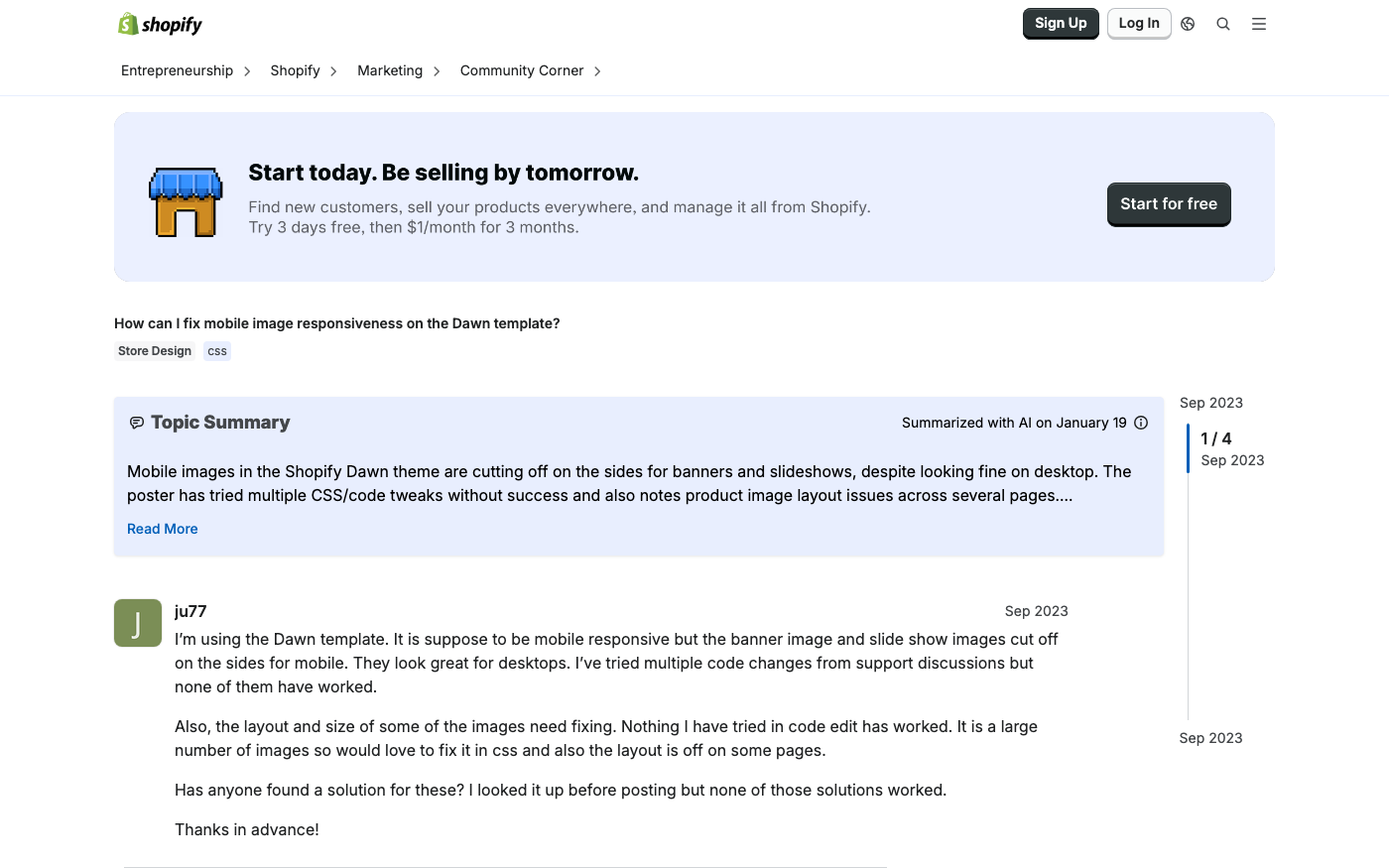
Dawn's image sections often break down on mobile due to:
Landscape images that crop poorly on vertical screens
Text overlays that become unreadable
Slideshow controls that don't respond to touch properly
Right now all of them get cut off edges when 750px.
This issue affects homepage banners, collection headers, and promotional sections.
Mobile Menu and Navigation Breaks
The screen width when the main navigation menu hides and the mobile drawer menu(burger icon) shows up is 990px. I need to change that to 750px.
Common navigation problems:
Menu appears on wrong screen sizes
Hamburger icon not responding to taps
Submenu dropdowns extending off-screen
Search functionality hidden or broken
Cart and Checkout Mobile Problems
Mobile cart issues create the highest revenue impact because they occur at the moment of purchase.
Baymard Institute's 50-study meta-analysis establishes the gold standard here: the global average cart abandonment rate sits at 70.22% in 2024. That means roughly 7 out of 10 carts never result in an order.
These technical solutions address the most common Dawn mobile layout problems. Apply them systematically, testing each change before moving to the next.
CSS Media Query Solutions
Dawn uses specific breakpoints that you can modify to improve mobile layouts.
Locate.header__inline-menuMedia query and swap max-width: 990px for max-width: 750px.
Use Dawn's built-in theme settings before adding custom code:
Navigation: Go to Theme Settings → Header → Mobile menu appearance
Product pages: Adjust image ratio and gallery layout
Cart settings: Enable cart drawer for mobile users
Typography: Ensure minimum 16px font size for mobile
Liquid Template Modifications
For more complex fixes, modify Dawn's Liquid templates. The key files for mobile optimization:
main-product.liquid - Controls product page mobile layout
header.liquid - Manages mobile navigation behavior cart-drawer.liquid - Handles mobile cart experience
"Fixing these requires responsive CSS adjustments and sometimes structural changes to the mobile layout in main-product.liquid." - TaskHusky Dawn Theme Analysis
When Custom Code is Needed
Some mobile layout fixes require custom development:
Complex breakpoint adjustments across multiple files
Touch gesture implementations for image galleries
Custom mobile-specific layouts that differ significantly from desktop
Advanced cart drawer functionality
For these scenarios, consider working with theme customization experts who specialize in Dawn theme modifications.
Fix Type
DIY Difficulty
Time Required
Risk Level
CSS media queries
Beginner
1-2 hours
Low
Theme settings
Beginner
30 minutes
None
Liquid modifications
Intermediate
4-8 hours
Medium
Complex custom code
Advanced
16+ hours
High
Product Page Mobile Optimization
Product pages drive the majority of mobile conversions, making their optimization critical for revenue. Focus on these high-impact elements first.
Above-the-Fold Layout Optimization
The most common mobile product page problems on Dawn stores: The product images are too small. On mobile, the image is the product. Shoppers can't touch the fabric or try on the jacket - the image is doing all of that work. A full-width image carousel that takes up most of the initial viewport performs better than a thumbnail-first layout.
Mobile-first product page structure:
Product title (always visible)
Price and savings information
Primary product image (60-70% of viewport)
Key variant selectors (color, size)
Add-to-cart button (sticky or prominent)
Mobile-Friendly Variant Selectors
The variant selector is hard to use on a touchscreen. Dropdown menus are built for mice. On mobile, they require a precise tap to open, then a scroll inside a small modal. Swatches and button selectors work much better on touch devices.
Replace dropdown selectors with:
Color swatches for visual variants
Button groups for sizes
Radio buttons for simple options
Expanded lists instead of collapsed dropdowns
Touch-Optimized Button Sizing
Baymard reports that tap-target mis-sizing, keyboard overlap, and hidden CTAs are top 3 mobile blockers. Fixing them can yield a 20% median mobile conversion improvement.
Systematic testing ensures your mobile layout fixes actually improve the user experience and don't create new problems. Follow this testing protocol after implementing any changes.
Simulate different devices - Test iPhone, Android, and tablet viewports
Check performance - Monitor loading times and rendering issues
Validate touch targets - Ensure all interactive elements are easily tappable
Test form interactions - Verify checkout and contact forms work properly
DevTools testing workflow:
Test at 375px, 412px, 768px, and 1024px widths
Rotate between portrait and landscape orientations
Simulate slow network connections
Check for horizontal scrolling issues
Real Device Testing Strategy
Browser simulation has limitations. Test on actual devices for accurate results:
Essential device testing:
iPhone (Safari) - latest and one previous generation
Android phone (Chrome) - test different screen sizes
iPad (Safari) - both orientations
Android tablet - verify layout scaling
Testing checklist for each device:
Navigation menu opens/closes properly
Product images display correctly
Checkout flow completes successfully
Page loading feels responsive
Performance Impact Assessment
Mobile layout changes can affect site speed. Monitor these metrics:
Metric
Target
Tool
First Contentful Paint
< 1.5s
PageSpeed Insights
Largest Contentful Paint
< 2.5s
Chrome DevTools
Cumulative Layout Shift
< 0.1
Web Vitals
Time to Interactive
< 3.5s
Lighthouse
Common Testing Mistakes to Avoid
Don't rely solely on browser simulation - Real devices behave differently than desktop browser emulation.
Don't test only one device type - iOS and Android have different behaviors, especially for forms and navigation.
Don't ignore edge cases - Test with slow internet connections and older devices that your customers might use.
Don't skip cross-browser testing - Mobile Safari and Chrome can render the same layout differently.
"Baymard's 200,000+ hours of UX testing prove that even world-class retailers leave 30–35% of potential conversions untapped simply because their checkout flows still make users think too hard." - Research data from leading usability studies
When to Seek Professional Help vs DIY Solutions
Understanding when to tackle Dawn mobile layout issues yourself versus hiring experts saves time and prevents costly mistakes. Use this framework to make the right decision for your situation.
Issues You Can Fix Yourself
Theme settings adjustments are safe for any merchant:
Enabling cart drawer
Adjusting image ratios
Changing typography sizes
Modifying color schemes
Simple CSS modifications work well for merchants comfortable with basic code:
Performance-critical optimizations need expert implementation:
Image optimization and lazy loading
Advanced caching strategies
Custom JavaScript for mobile interactions
Cross-browser compatibility fixes
Business-critical fixes shouldn't be attempted without expertise:
Checkout flow modifications
Payment processing customizations
SEO-sensitive template changes
Multi-language or currency implementations
Evaluating the Cost of Broken Mobile Layouts
Calculate the revenue impact of mobile layout issues to determine if professional fixes are worth the investment.
Revenue impact calculation:
Monthly mobile visitors × mobile conversion rate × average order value = monthly mobile revenue
If mobile conversion rate increases by 1%, multiply by 12 for annual revenue impact
Compare annual revenue gain to developer costs
Example calculation for a typical Shopify store:
10,000 monthly mobile visitors
Current 2% mobile conversion rate
$75 average order value
Current monthly mobile revenue: 10,000 × 0.02 × $75 = $15,000
If mobile conversion improves to 3%: 10,000 × 0.03 × $75 = $22,500
Monthly revenue increase: $7,500
Annual revenue increase: $90,000
In this example, investing $5,000-$15,000 in professional mobile optimization pays for itself in 1-2 months.
For complex mobile layout issues that you can't resolve yourself, Shopify mobile optimization services can diagnose problems and implement solutions that improve conversion rates within weeks.
Problem Type
DIY Suitable
Risk Level
Professional Required
Button sizing
Yes
Low
No
Theme settings
Yes
None
No
Custom breakpoints
Maybe
Medium
Recommended
Layout restructure
No
High
Yes
Performance optimization
No
High
Yes
Checkout modifications
No
Critical
Yes
FAQ: Shopify Dawn theme mobile layout broken
Why is my Dawn theme not responsive on mobile?
Dawn is responsive by default, but common issues include conflicting CSS, incorrect viewport settings, or custom code that breaks mobile layouts. Check your theme customizations and any third-party apps that might interfere with responsive design.
How do I fix Dawn theme mobile layout issues?
Start with theme settings adjustments, then apply CSS media query fixes for specific problems. For complex issues like restructuring product pages or fixing checkout flows, consider professional development help.
Dawn theme mobile menu not working?
The most common cause is breakpoint conflicts.
The screen width when the main navigation menu hides and the mobile drawer menu(burger icon) shows up is 990px. I need to change that to 750px.
Adjust the breakpoint in your CSS to fix this.
How do I test Shopify mobile responsiveness?
Use both Chrome DevTools device simulation and real device testing. Focus on key screen sizes (375px, 412px, 768px) and test critical functions like navigation, cart, and checkout on actual mobile devices.
Why are my product pages not mobile-optimized?
Dawn is mobile-responsive out of the box, which means it scales the desktop layout down to fit a smaller screen. That's different from being mobile-optimized, which means the layout is designed for how people actually use their phones.
You may need custom modifications to truly optimize for mobile user behavior.
What's the minimum button size for mobile?
Minimum tap target size for mobile is 44px by 44px.
This ensures buttons are easily tappable on touch devices without accidental taps on nearby elements.
How do I fix mobile image issues in Dawn?
Common fixes include adjusting image aspect ratios, implementing proper image scaling in CSS media queries, and ensuring image carousels work well with touch gestures.
This would be good for showing landscape images on desktop, and optimized square/portrait imagery for mobile viewing.
Summary
Dawn theme mobile layout issues significantly impact conversion rates, with more than 60% of Shopify traffic comes from mobile devices.
The most critical problems include small touch targets, hidden pricing information, broken variant selectors, and navigation issues that occur at specific breakpoints.
Key takeaways for fixing Dawn mobile layouts:
Start with diagnostics using both Chrome DevTools and real device testing to identify specific problems
Focus on high-impact elements like product page layout, add-to-cart buttons, and navigation menus first
Use Dawn's built-in settings before attempting custom code modifications
Apply CSS media query fixes for common issues like button sizing and breakpoint adjustments
Consider professional help for complex template modifications or performance-critical optimizations
Implementation priorities:
Fix touch target sizing (minimum 44px)
Ensure product titles and prices are visible above the fold
Replace dropdown variant selectors with mobile-friendly alternatives
Optimize image carousels for touch interactions
Test thoroughly on real devices before going live
Business impact: Properly optimized Dawn mobile layouts can increase mobile conversion rates by 20% or more, translating to significant revenue gains.
Fixing them can yield a 20% median mobile conversion improvement.
With mobile cart abandonment rates reaching 80.2%, every improvement to mobile UX directly impacts your bottom line.
Remember that mobile optimization is an ongoing process, not a one-time fix. Regular testing and incremental improvements ensure your Dawn theme continues to perform well as mobile devices and user expectations evolve.
Get Your Dawn Mobile Layout Fixed by Shopify Experts
Don't let mobile layout issues cost you sales. Krish's Shopify experts can diagnose and fix your Shopify Dawn theme mobile layout broken problems in days, not weeks. Get your get a free consultation and see how we've helped 1000+ stores optimize their mobile experience.